In today’s digital landscape, having one of the best law firm websites is crucial for legal practices aiming to establish a strong online presence. A well-crafted website is not just a digital storefront; it’s a powerful tool that can significantly influence a firm’s reputation, client acquisition, and overall success. As a web design professional, I’ve analyzed some of the top law firm websites in Australia for 2024 to highlight what makes them stand out. These best law firm websites exemplify industry-leading practices in design, user experience, and content strategy, ensuring they meet the needs of potential clients while reflecting the firm’s brand identity!!!
Read more: Building a WordPress Website for Free with ChatGPT in 1 day
1. Allens
Website: https://www.allens.com.au/
Design & User Experience:
Allens’ website is a perfect example of how simplicity can convey sophistication, making it one of the best law firm websites. The minimalist design, with its ample white space and high-quality imagery, creates a professional and welcoming atmosphere. This design approach ensures that the focus remains on the content, making it easy for users to find relevant information quickly.
Content Strategy:
The site’s content is strategically placed to guide users through the firm’s offerings, a hallmark of the best law firm websites. The use of concise, impactful copy, especially on the homepage, ensures that visitors immediately understand Allens’ areas of expertise. The website also features detailed case studies and insights, which not only demonstrate the firm’s thought leadership but also help build trust with potential clients.
Responsive Design:
Given the increasing mobile traffic, Allens has ensured that their website is fully responsive, another key feature of the best law firm websites. The design adapts seamlessly to various screen sizes, maintaining usability and aesthetic appeal across all devices.
Read more: Guidelines for Choosing an Affordable WordPress Website Design Service in Melbourne
2. MinterEllison
Website: https://www.minterellison.com/
Design & User Experience:
MinterEllison’s website combines traditional elements with modern design to create a user-friendly experience, positioning it among the best law firm websites. The clean layout and intuitive navigation are particularly noteworthy, as they allow users to easily explore the firm’s extensive range of services.
Interactive Elements:
The website effectively uses interactive elements, such as the “Insights” section, which provides valuable information in an engaging format. This not only keeps users on the site longer but also positions MinterEllison as a thought leader in the legal industry, a common trait among the best law firm websites.
Accessibility:
The design also prioritizes accessibility, with features such as adjustable text sizes and clear navigation menus. This ensures that the website is usable by a wide audience, including those with disabilities, thereby expanding the firm’s reach, a critical aspect of the best law firm websites.
Read more: Website Maintenance Costs 2024
3. Clayton Utz
Website: https://www.claytonutz.com/
Visual Appeal:
Clayton Utz’s website is visually striking, utilizing bold imagery and a color palette that reflects the firm’s brand identity, which is essential for the best law firm websites. The use of large, high-resolution images on the homepage immediately captures the visitor’s attention, making a strong first impression.
Content Organization:
The content is well-organized, with clear headings and subheadings that guide users through the site. This structure not only improves navigation but also enhances the user experience by making it easy to find specific information, which is typical of the best law firm websites.
Mobile Responsiveness:
Like Allens, Clayton Utz has also prioritized mobile responsiveness, a must for the best law firm websites. The website maintains its functionality and aesthetic appeal across all devices, ensuring a consistent user experience.
Read more: Migrate WordPress Site to New Domain: Step-by-Step Guide
4. Herbert Smith Freehills
Website: https://www.herbertsmithfreehills.com/
Global Reach Representation:
Herbert Smith Freehills’ website effectively communicates the firm’s global reach, a feature seen in the best law firm websites. The design uses a combination of visuals and text to highlight the firm’s international presence, making it clear that they are well-equipped to handle complex, cross-border legal matters.
User Trust & Credibility:
The “Our People” section is a standout feature, providing detailed profiles of the firm’s key professionals. This not only personalizes the website but also helps build trust with potential clients by showcasing the expertise of the firm’s lawyers, a strategy employed by the best law firm websites.
Content Hierarchy:
The content is organized in a clear hierarchy, with the most important information at the top of each page. This ensures that users can quickly find what they’re looking for without having to scroll through unnecessary content, a hallmark of the best law firm websites.
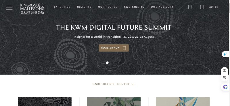
5. King & Wood Mallesons
Website: https://www.kwm.com/au/en/home.html
Design Innovation:
King & Wood Mallesons’ website is a great example of how innovation can enhance user experience, making it one of the best law firm websites. The site incorporates multimedia elements, such as videos and infographics, to convey complex information in an easily digestible format.
Interactive Map:
One of the site’s most innovative features is the interactive map that highlights the firm’s global offices. This feature not only adds a layer of interactivity but also helps users quickly locate the nearest office, improving the overall user experience, a common characteristic of the best law firm websites.
Visual Hierarchy:
The visual hierarchy is well-executed, with important elements such as calls to action and key services prominently displayed. This guides the user’s journey through the site, ensuring they engage with the most critical content, which is essential for the best law firm websites.
6. Corrs Chambers Westgarth
Website: https://www.corrs.com.au/
Client-Centric Design:
Corrs Chambers Westgarth’s website is designed with the client in mind, reflecting the principles of the best law firm websites. The clean, uncluttered layout makes it easy for users to navigate the site and find the information they need. This user-first approach is evident in the strategic use of whitespace, which gives the content room to breathe and makes the site feel less overwhelming.
Content Strategy:
The firm’s blog section is particularly well-executed, providing regular updates on legal trends and developments. This not only adds value to the user but also positions Corrs Chambers Westgarth as a leader in legal thought leadership, a trait common to the best law firm websites.
Mobile Optimization:
The site is fully optimized for mobile devices, ensuring that users have a consistent experience regardless of the device they are using. This is crucial in today’s mobile-first world, where a significant portion of web traffic comes from smartphones and tablets, a standard for the best law firm websites.
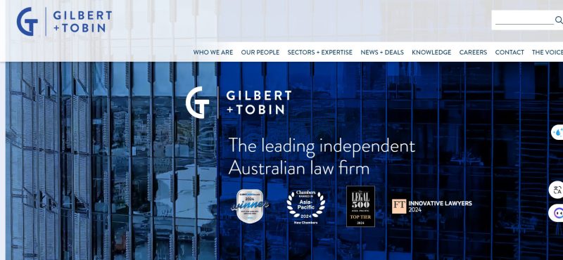
7. Gilbert + Tobin
Website: https://www.gtlaw.com.au/
Dynamic Design:
Gilbert + Tobin’s website is one of the most dynamic on this list, making it a standout among the best law firm websites. The bold color scheme and interactive elements create an engaging user experience that encourages visitors to explore the site further.
Content Delivery:
The rotating banner on the homepage is an effective way to highlight the firm’s latest news and achievements. This keeps the content fresh and ensures that users are always presented with the most relevant information, a strategy used by the best law firm websites.
User Engagement:
The site’s structure is designed to encourage user engagement, with clear pathways to practice areas, client stories, and thought leadership pieces. This makes it easy for users to find the information they need and keeps them on the site longer, a goal of the best law firm websites.
8. Ashurst
Balanced Design:
Ashurst’s website achieves a balance between traditional and contemporary design elements, a balance often seen in the best law firm websites. The large images and succinct text on the homepage convey the firm’s key messages effectively, while the simple navigation allows users to access information quickly.
Content Strategy:
The website’s commitment to providing valuable content is evident in its regularly updated insights and resources sections. This not only adds value for the user but also helps to establish Ashurst as a leader in the legal field, aligning it with the best law firm websites.
User Journey:
The design of the site guides users through a logical journey, from the homepage to specific practice areas and resources. This ensures that users can easily find the information they need, enhancing the overall user experience, a hallmark of the best law firm websites.
9. Maurice Blackburn
User-Friendly Layout:
Maurice Blackburn’s website is designed with the user in mind, reflecting the principles of the best law firm websites. The simple, straightforward layout makes it easy for visitors to navigate the site and find the information they need. The use of clear headings and subheadings helps to organize the content, making it easier to digest.
Content Strategy:
The homepage prominently features the firm’s areas of expertise and client testimonials, which helps to build trust and credibility. The website’s design is responsive, ensuring that it looks and functions well on all devices, a common feature of the best law firm websites.
Trust & Transparency:
The site’s commitment to transparency is evident in the detailed information provided about fees and processes. This helps to demystify the legal process for potential clients, making it easier for them to make informed decisions, a strategy used by the best law firm websites.
10. Hall & Wilcox
Innovative Design:
Hall & Wilcox’s website reflects the firm’s commitment to innovation and client service, making it one of the best law firm websites. The clean, modern design is complemented by an intuitive layout that makes it easy for users to navigate the site and find the information they need.
Interactive Features:
The site includes various interactive features that encourage user engagement, such as case studies and client testimonials. These elements not only add value for the user but also help to build trust and credibility, a common trait of the best law firm websites.
Content Strategy:
The website’s content is well-organized, with clear sections for practice areas, news, and insights. This makes it easy for users to find the information they need, enhancing the overall user


